3 years ago we started getting requests regarding Responsive Design; little by little it has become a major buzzword.
At the time, our vision was to provide the same user experience Facebook gives to Web/Desktop and Native Apps/Mobile, with the best technology for each medium.
Financially, this is not within the means of most, but the culture of our industrial products leads us to believe that it is possible to reduce the cost of a mobile app to 1/50th of the original.
Today, with the duo of WMaker / GoodBarber products, this is attainable, but as they are still separate products, it will take us a bit more time to optimize and simplify this concept.

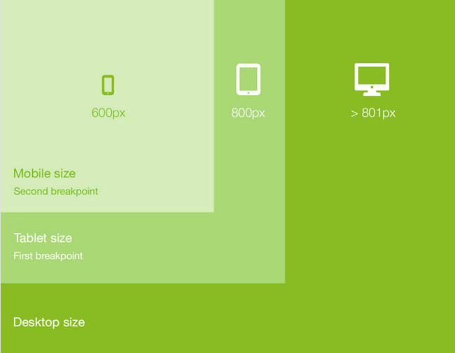
Responsive Design uses fairly simple and inexpensive technology, but also requires simple and adapted designs.
If you redo your site from scratch, there will be no problem. However, if you have a complex media site, this can quickly become a headache; Lemonde.fr, for example, is not responsive.
We decided to create responsive templates just to say that we have "responsive templates", but we all knew too well that our users would have to recreate their sites from scratch in order for this to work.
WMaker has several thousand sites, which means that all of these sites would not be responsive before 2 or 3 years—maybe more.
Therefore, we have focused our efforts on making the mobile version compatible with one of the three options recommended by Google SEO: the mobile version m.site.com.
A second one is in progress, which is the dynamic detection of the device to keep the same URL.
I hate asking the team to work on something, knowing that it will only partially solve a problem. But the there was a lot of pressure on us to provide responsive designs.

This is where our magic trio Lesia, Laurent, and Jean-Mathieu came into play: "We aren't going to start by responsive templates, we are going to deal with the problem head on by making 100% of WMaker sites responsive in 1 click".
The idea sounded great, but there were a multitude of problems to resolve.
We had to rewrite all WMaker modules, but it was also necessary for our solutions to be retro-compatible with the thousands of existing combinations.
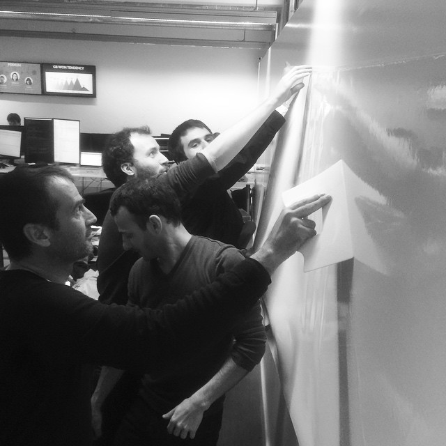
Lesia created a bible of graphic design patterns to predict as many combinations as possible. Laurent and Jean-Mathieu are very experienced, they know WMaker down to the last detail, and have repetitively done great work with Lesia.
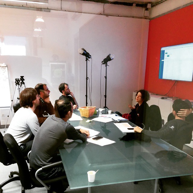
I attended several meetings in the beginning concerning possible cases; there were hundreds of rules that needed to be imposed on these design patterns. But everything went very smoothly, they had a great working dynamic.

We have exact copies of all of our clients' sites in our servers which has allowed us to test with real data, in order to understand the behavior that would take place in real cases.
Throughout this development, we reviewed hundreds of sites, some of the most complicated, to see how the behavior would turn out.
After 15 days of fun with the copies of your data, we silently put our completed work into production on all servers.
The responsive design pages are heavier since they involve both Web and Mobile design, but with 4G there is not much of a noticeable lag related to the weight of the pages.
I asked the team to wait a few more days in order to be safe and run some guinea pig tests, but now I can't wait any longer!
The end result is like magic, in just one click you have a 100% responsive version.
This is also 100% reversible if you prefer the mobile version, so there is no risk in testing it.


