On April 21, Google will change the ranking of its search engine website results for searches done on a mobile device. The purpose of this modification is to better take into account mobile devices, since the search is being made from one.
This will be initially communicated to the user through an alert concerning the mobile compatibility of the site the user is searching for on their mobile device.
After, the non-optimized-for-mobile content will fall in the search results. However, Google has not given a lot of additional information on the plans for this second phase.
For those who are interested, Google has launched a site designated for developers:
https://developers.google.com/webmasters/mobile-sites/
https://developers.google.com/webmasters/mobile-sites/
Google requests an indication in the website's source code of which of the three following mobile configurations your site uses:
However, this constrains to create a specific mobile version.
- Responsive Design : used mainly in showcase websites, the style sheet modifies the display depending on the size of the browser's window.
- Dynamic Serving : by keeping the same URL when the server detects a mobile device, it sends a mobile version of the site.
- Distinct URL : the visitor is automatically directed to the URL of the mobile site in the format: http://m.site.com ; this is WMaker's technology of choice.
However, this constrains to create a specific mobile version.

We have modified your sites' source codes so that the mobile versions will be properly taken into account starting April 21. Technically this is to indicate to the engine the correspondence between the Desktop and Mobile versions.
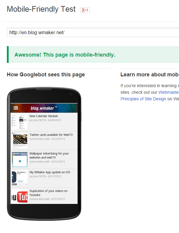
Concerning the mobile version itself, Google has provided a validation test:
https://www.google.com/webmasters/tools/mobile-friendly/
You can test your site; this will allow you to verify that your mobile version has been correctly configured.
Concerning the mobile version itself, Google has provided a validation test:
https://www.google.com/webmasters/tools/mobile-friendly/
You can test your site; this will allow you to verify that your mobile version has been correctly configured.
We have added new display modes that facilitate the implementation of a more static mobile site.
Sections also benefit from the new and diverse templates from GoodBarber.
And finally there is the option to directly link an article, for example one of the related pages.
You have many tools to create a great mobile version, the next article will explain these new functionalities in greater detail.


