Headlines modules :News 1/3
Saveria Maroselli

Using the framework javascript JQuery in the front office opens a new field of opportunities for the modules of your site.
Therefore, I have many things to show you on these modules that are very important for a successful home page. I'll split the presentation of those news in 2 notes. In that one, I will tell you about the four new modules reserved to the title area of the site.
Until now, you used the modules headlines in the central area. With these four there, you'll be able to add this module to the title area. If you opt for a module headlines in this area, it will not be displayed in the internal pages but only on the home page.
So there are four different types of presentations. Let's review them.
Modern 8, the most visual
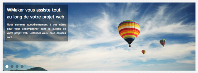
We chose to illustrate this note with the modern 8 (image above)
Modern 8 is the most visual module. It consists of a large image, which occupies the entire width of the template. The title and meta information associated with the item (description, author, date, ...) are displayed on a square in opacity on the picture.
Modern 8 can publish up to 5 items on the headlines. A pager as "bullets" (small round style iOS) to navigate between different articles. Opacity is automatically applied to the bullets.
For the transitions display, you can choose between two effects:
- Slide: sliding effect during a transition from one article to another
- Fade: Fade Effect
It is possible to choose an auto-scroll and adjust the timing of the scroll.
You can notice that the configuration interface of the module has also been improved. The options are contextual and appear according to their activation or not. This avoids overloading the interface unnecessarily, and makes the setup more intuitive.
Modern 9, sober and elegant

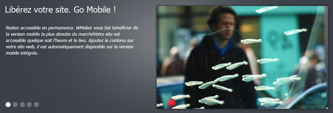
On the left, the title and metadata of the article. On the right, on half of the module, the photo associated. An image average sized will be enough to dress this module.
Note the shaded effect on CSS3 on the contours of the image. The shadow is positioned outside of the border.
Modern 9 can accommodate up to 5 articles on the headlines. Navigation is done from the pager Bullets. The effect of transition is of type Fade.
Modern 10, arrow in CSS3

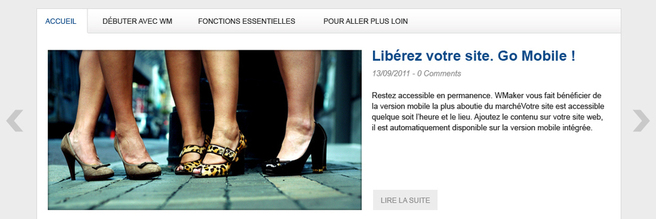
With modern 10, you can place up to 5 items on the headlines. For the effect of transition between the articles, you can choose between Fade and Slide. Automatic scrolling is possible.
The peculiarity of modern 10 lies in the arrows to navigate between articles. The arrows are off the template. These are not images, but the arrows are made entirely in CSS3. This allows not only to improve the speed of display, but also an easy customization. To do this, simply work on the font Pager of the module. You can then play with their colours.
If the possibility to customize the default CSS arrows do not suit you, you can replace them with personal pictures. In that case, you will upload in the module two pictures. One for the right arrow and one for the left arrow.
Modern 11, the heir of the Web TV

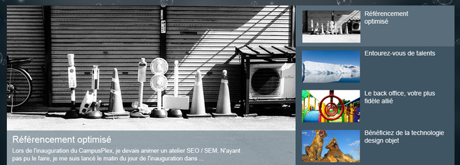
Modern 11 is directly inspired by one of the headlines modules of a Web TV. The image is on the left and pretty large. On the right, in column, the list of articles on the headlines.
For the selected articles, we can find their title and meta information on an horizontal strip in opacity on the image. The colour of the opacity is the dominant font and remains consistent with the background colour of the module. The colour of the selected article matches the background colour of the font title.
Fade effect is used to transition between articles. Automatic scrolling is possible and you can also set the break on the description of articles for the four positions to work your slogan and catchwords in e fine way.
To follow...
We've just seen the novelties of the title area of CMS.
In the next notes, We will present other novelties about the headline modules of the CMS and WebTv.
In the next notes, We will present other novelties about the headline modules of the CMS and WebTv.
