The revival of webservice Calendar
Saveria Maroselli

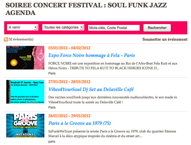
1. Thumbnail in the event list

I hope this new format will make you want to illustrate your events with beautiful pictures.
2. Navigation Bar
In the list of events, a navigation bar has turned up.
It allows you to apply filters on the list:
- Filter time: Next / Today / This Week / This Month / Archives
- Filter by category
It also provides a search engine.
The search field enables to find an event from its title, its city or zip code.
It allows you to apply filters on the list:
- Filter time: Next / Today / This Week / This Month / Archives
- Filter by category
It also provides a search engine.
The search field enables to find an event from its title, its city or zip code.
3. RSS feeds and submission of events
Under the navigation bar, users can find the RSS feed of events. Note that you have an RSS feed by category, in addition to the RSS feed of all events.
To the right of this feed, we find the link Post an event.
A new font was added to give you more flexibility while customizing this link.
For the submission page, I let you discover the reorganization.
We added some subtlety: When selecting an event date, the choice is made on a small calendar.
To the right of this feed, we find the link Post an event.
A new font was added to give you more flexibility while customizing this link.
For the submission page, I let you discover the reorganization.
We added some subtlety: When selecting an event date, the choice is made on a small calendar.
4. Visual of the event page

First of all, the page event has been restructured. It is organized as follows:
- Title
- Visual
- Practical information
- Description
My favorite goes to the work that has been done on the visual:
a) Ideally, you have filled in an address and added a photo to your event.
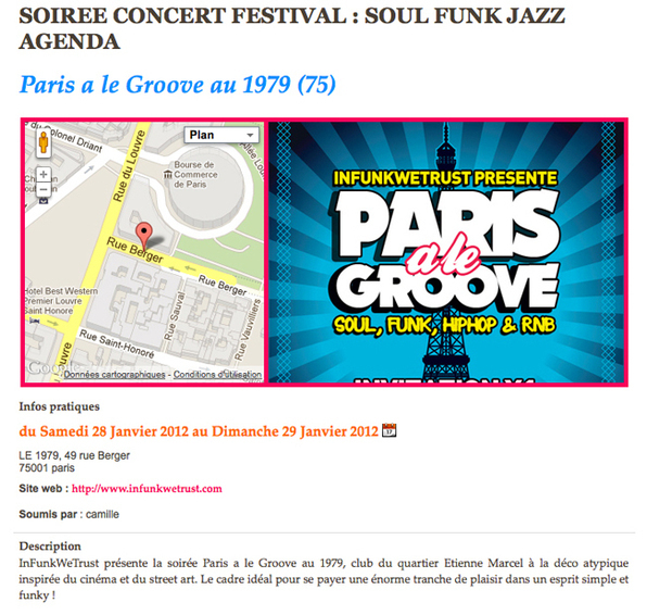
In this case, as shown in the first photo in this post, the visual consists of 2 parts: the map and the photo. at the mouseover on the map, it unfolds across the width of the column. When clicking on the map, the visitor is sent to the Map Page.
b) If you do not have filled in an address for the event, the visual displays only the photo in full width (as shown in the screenshot above)
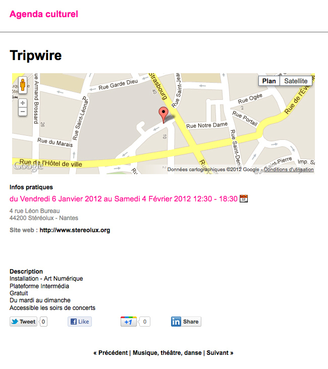
c) If you have not added any photo, but you have filled in the address, the map will use the full width (as shown in the screenshot below).
d) If there is no photo or address added to the event ... there will be no visual.

