V6: New article page
Saveria Maroselli
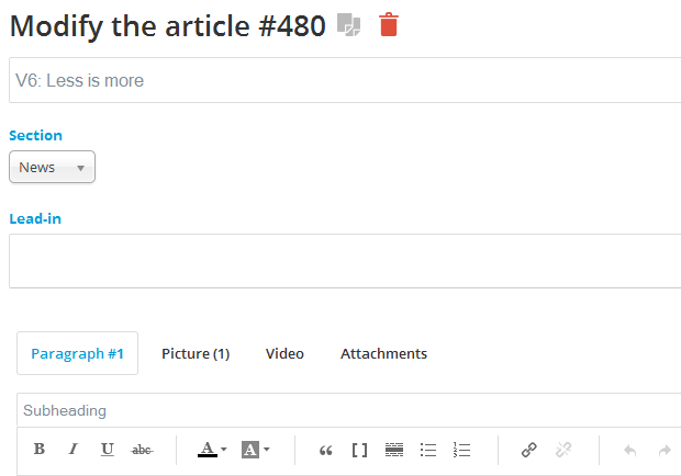
As Sébastien explained to you in our previous note, one of the main purpose of this new version was to improve your work tool: the back office. We had of course, to redo completely the article edition page. In the last few days, you have been many to ask more about the new features of the V6, it was about time to get to the heart of the matter.
Main zone
To write an article, it is very important to have a neat, clear and comfy space. So we started by improving the writing area by making its fields bigger, removing all unnecessary borders and of course, by making the column bigger. This zone is in the end clearer, uncluttered and highlights the most important thing, your writing space. It goes for a large panel of screens, but not for mobile yet, it's coming soon...
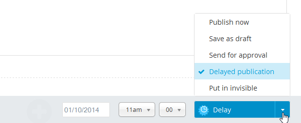
It is also very convenient when we write an article to have all action buttons to save and preview within reach of click. It is now the case, those buttons are at the bottom of the screen, and follow the vertical scroll in the page. In short, it's the little brother of the sticky zone but instead of sticking to the top, it sticks to the bottom of the page.
An other novelty about actions: you can now from the same button choose the status of publication (draft, published, stock, delayed publication, invisible etc..) and save the article.
Pictures, video and attachments tabs
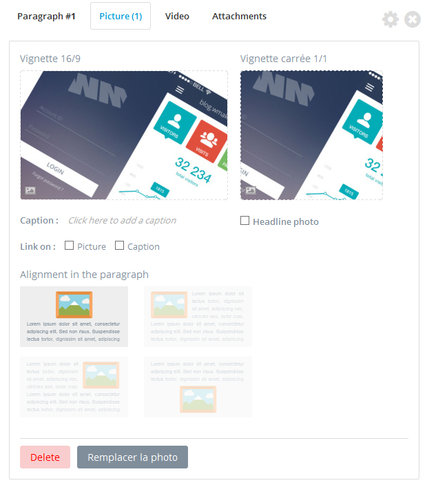
You use those tabs every day, so it was crucial to make them better. We removed the flash uploader, browsers have improved a lot, so we could replace the flash technology by javascript, even for heavy files. Adding media, is made now directly from the tabs, and not any more from an ibox.
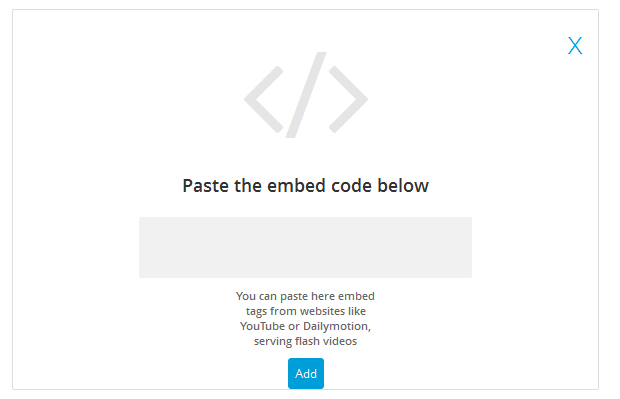
Once the picture or video added, the visual has been a lot improved. For the pictures, we reorganized the different display options and the thumbnails are in real size. For the embed videos (Youtube, DailyMotion, etc...), you can see strait away the display, and read them from the tab directly.
Advanced settings
Remember, to organize your paragraphs, add a background colour or a page break, you had to switch to an other page. In addition to lose a click, you also lost all your work environment and it was sometimes difficult to see what was going on.
So to move a paragraph, you just need to hoover the tab zone, then drag&drop it. To add either a background colour, page break or border, click on the settings wheel next to the deleting paragraph cross, then choose the action you need in the drop down menu.
And finally, not only the access to the advanced settings had been simplified, we have also improved the visual feedback of those actions. Try to edit the background colour of a paragraph, you'll see it immediately. Page breaks are now viewable on the writing form. We're sure some of you just discovered those powerful options, a little bit hidden in our previous version.
Metadatas
As we said before, the guiding principle when we redid this page was to make it easier to improve all feature access.
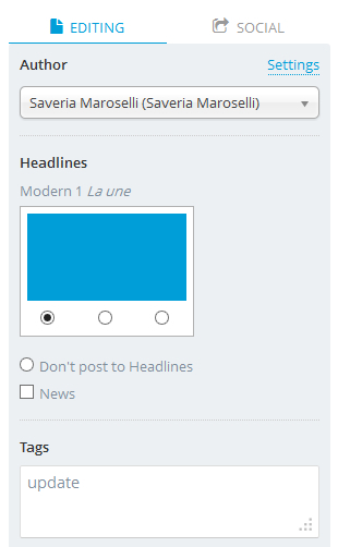
Metadatas were default settings of the article (date, author...) we had put them in a folded menu because we thought you wouldn't use them for every post. But in the end, it not only created an inertia in their modification but it also made you lose your visual feedback on these informations. That led you in some cases to go back and forth between the preview and the writing form and you lost more than one click.
Now you can find all metadatas on the right column.
