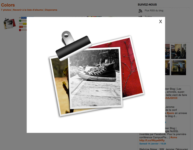
Example of the new ibox with opacity on the page and borderless
Lesia and Laurent made a nice update of the iBox. More refined and even more customizable, you will be able to refine the design of your sites and improve the user experience.
1 / The borders of the ibox were reduced. They went from 30 px to 5 px.
2 / The icon for the closure of the iBox is customizable. By default, it is a cross, but you can replace it with the image of your choice.
3 / You can choose straight edges or rounded edges for your ibox.
4 / You can also apply an opacity on the page when appears the iBox. It allows you to visually isolate the ibox in a very pronounced way.
All these settings from Design > General Settings > Graphical elements > tab ibox & Forms


