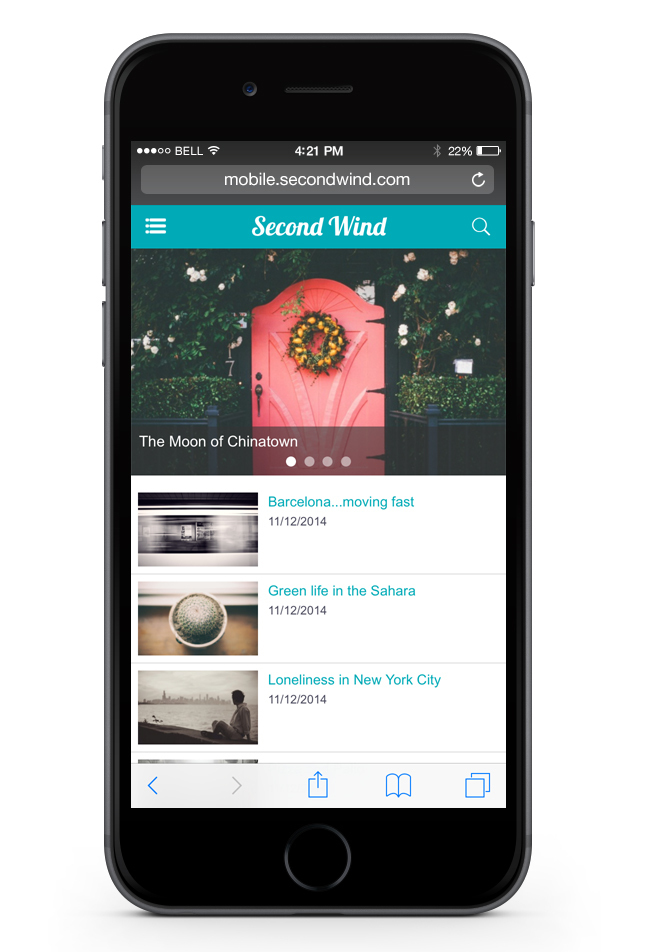
Home: Top news module Slideshow / Latest news Classic
There we go! As you may have noticed, our mobile version has changed, and it’s much more in keeping with the times!
The old version was obsolete; with the constant development of mobiles, it was imperative that you could access a pretty version of your sites for mobiles.
The old version was obsolete; with the constant development of mobiles, it was imperative that you could access a pretty version of your sites for mobiles.
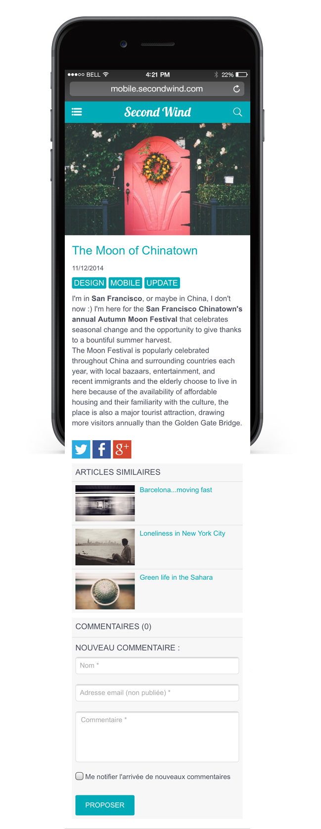
First, we redesigned existing modules to get a proper design worthy of a "beautiful app ", and we also updated internal pages of content.
We didn't only improve the existing :)
We also added very useful new features :
- new module to subscribe to the newsletters
- internal page for the Gallery webservice
- Swipe menu to navigate through your site
- management of your internal pages organized just like in the web version
Let's have a look together.

New article / video page
Redesign of the modules

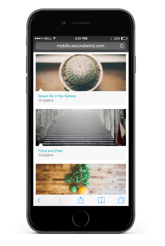
Latest news module / Visual
Your modules have been completely redesigned. Lesia, our Artistic director, with Jim and Seb2 (your loyal developers) have worked hard to make a clean, beautiful mobile version.
We had to do some cleaning and get rid of some modules as the module headlines sections did not fit any more for what we're looking for in a mobile version today. If you had one, replace it with a Latest news module. For instance, that module, compared to the previous version, gives you the possibility to choose between 3 display types and to choose which section(s) you want. You can also display the date, time and author via the tokens.
All our modules have been completely redesigned to give you more options about settings and display.
We advise you to go to your back office and start testing asap!
New internal page and modules

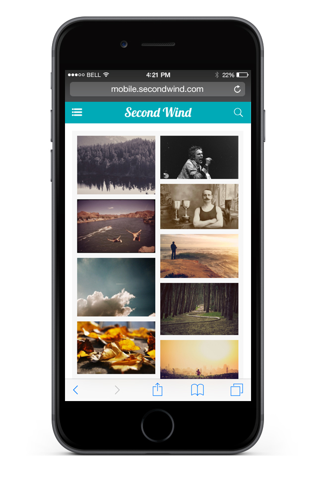
Gallery page
You will notice that now you have a newsletter module available so your visitors can register to receive your NL. We also finally added the webservice page of the Gallery for mobile! You can today highlight your albums on your mobile version.
More modules and internal pages are coming for the act II ;)
More modules and internal pages are coming for the act II ;)
Back office improvement
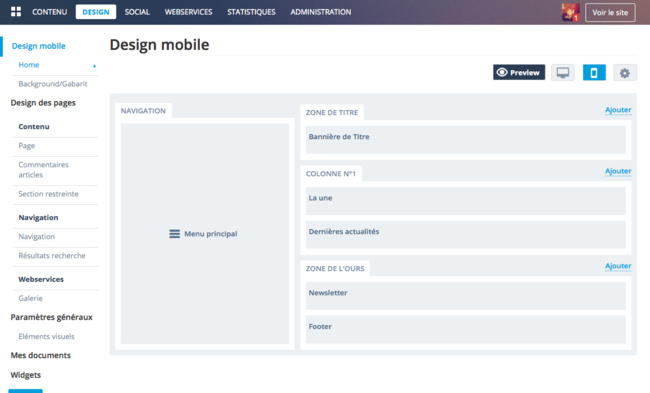
The menu Design > Mobile of your back office has changed. You can now manage your internal pages exactly the same way as for the web version. Use the menu Design > Page design > Page concerned in the left-hand column to access their settings.
We added a Preview button on the top right to enable an easy preview.
And you will notice the Main menu! Which brings us to the Swipe menu :)
We added a Preview button on the top right to enable an easy preview.
And you will notice the Main menu! Which brings us to the Swipe menu :)
Swipe menu
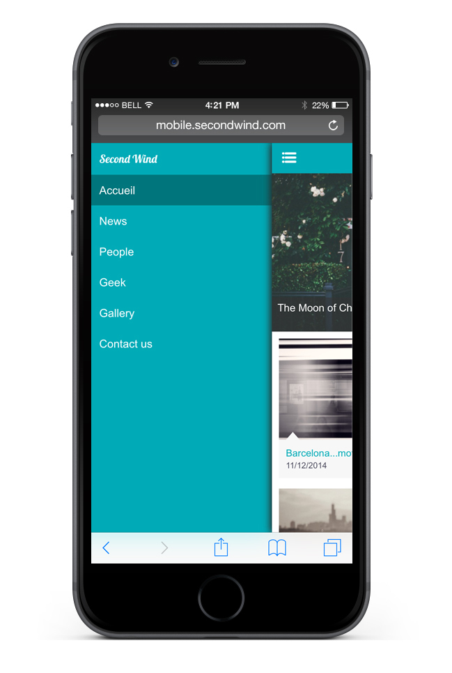
Swipe menu
A column is reserved for the main menu of your mobile version. The Swipe menu allows you to go from one section to another, and they are available immediately from all of your pages. You now can browse in a natural way on your mobile version.
It is very easy to set, in the same way as for any navigation module, you add your links to your content, but you can also use mobile features such as an phone number or an email.
Don't hesitate to test all these novelties and send us your feedback!
It is very easy to set, in the same way as for any navigation module, you add your links to your content, but you can also use mobile features such as an phone number or an email.
Don't hesitate to test all these novelties and send us your feedback!


