New possibilities for customization of the Search Module have just been published.
You have a choice of 3 styles of presentation for the search button:
- off the typing field
- next to the typing field
- integrated
You have a choice of 3 styles of presentation for the search button:
- off the typing field
- next to the typing field
- integrated
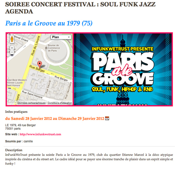
New look, new features, we brought a lot of novelties to the webservice Calendar.
Lately, we have made various tests to optimize the source code of WMaker. The aim is always the same: improve the indexing of your content by search engines.
The field of SEO (Search Engine Optimization) is changing very fast. It is an increasingly fierce competition. Even the smallest details are important to put the odds on your side and hoping to be well referenced.
Here we go with the summary of the 10 changes that have been put into production.
The field of SEO (Search Engine Optimization) is changing very fast. It is an increasingly fierce competition. Even the smallest details are important to put the odds on your side and hoping to be well referenced.
Here we go with the summary of the 10 changes that have been put into production.

The series of news exploiting the CSS3 potential is coming to an end. After the effects on the buttons, the iBox and iBox connection, forms, now it's the turn of the format of the site.
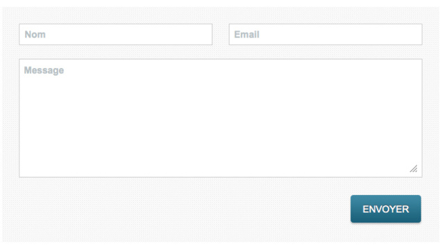
To give a more modern look to the input fields on your site, we can now act on two new settings:
- Spacing: the higher it is, the bigger the space will be between the text and the input field
- Text size
To set those go to the menu Design > General settings > Graphical elements > tab ibox & Forms.
These settings will be applied to all your forms, and all input fields on your site, such as the search engine.
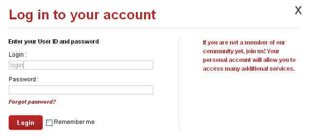
Many of you congratulated us for the subscribtion ibox used on Goodbarber . So, we thought it would probably be a good thing to improve the ibox connection on the CMS and Web TV.
Here is the new ibox connection:
Here is the new ibox connection:
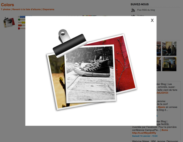
Lesia and Laurent made a nice update of the iBox. More refined and even more customizable, you will be able to refine the design of your sites and improve the user experience.
1 / The borders of the ibox were reduced. They went from 30 px to 5 px.
2 / The icon for the closure of the iBox is customizable. By default, it is a cross, but you can replace it with the image of your choice.
3 / You can choose straight edges or rounded edges for your ibox.
4 / You can also apply an opacity on the page when appears the iBox. It allows you to visually isolate the ibox in a very pronounced way.
All these settings from Design > General Settings > Graphical elements > tab ibox & Forms
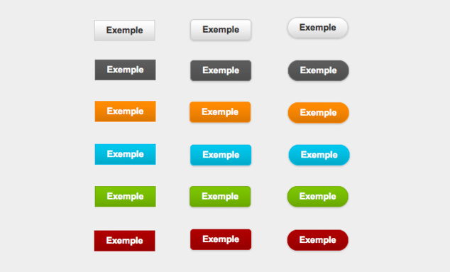
Some important detail just turned up in your back office. You can now customize buttons for the submission of your site.
Submission buttons are a little bit everywhere: in the forms on the registration pages, store, classified adds... In short, every time your users should post you an information.
Until now, there was two possibilities for these buttons. It was either the design of the browser button that was used, or a unique design WM. It was quite inhomogeneous so we decided to put some order and take this opportunity to offer you new products.

At the beginning of 2012, with a weather that good, we could almost go to the beach. But instead, we got started on the implementation of the roadmap presented at the OpenCampus.
We'll make a strong start tomorrow!!
Meanwhile, WMaker team send you his best wishes for 2012.
We'll make a strong start tomorrow!!
Meanwhile, WMaker team send you his best wishes for 2012.
Last tweets
Photostream
Last comments
-
Ken le 01/25/2014
Add chapters to your videos
-
Andrea le 09/05/2013
Add chapters to your videos
-
Florian le 05/02/2012
Lastest novelties of the month
-
Jerome Granados le 02/16/2012
Did you activate your author page?
-
masoud le 02/16/2012
Did you activate your author page?
Tags
ads
advertising
api
apps
article
atom
blog
calendar
CampusPlex
classifieds
comment
datacenter
design
design video
download
e-commerce
facebook
flash
flex
forum
gallery
google
headlines
help
hosting
iphone
management
metatag
micropayment
mobile
module
newsletter
openid
podcast
profiling
rss
search
search engine optimization
Search Engine Optimization
semantic web
seo
server
slideshow
sns
statistics
store
support
tags
template
twitter
upload
v4
video
web 2.0
webservice
webtv
wmaker
xfruits
xhtml
xml


