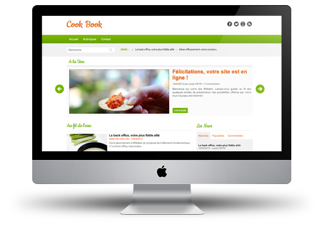
For all food and cooking lovers this template is for you :)
With its bright colours and stremalined format, this new template theme will hustle our collection.
For the skeptics, I think this design will finally convince you to the efficiency and aesthetics aspect of headlines modules in title area. But hey, as they say, too much effect kills the effect, so for the next template the organization and modes of display will be different ... I shall say no more :)
We also used this opportunity to highlight the recent work of Laurent on the Dropdown menu, to remain in harmony with the transition of the headlines module, we used a fade effect that is really the spirit of this template.
And to finish, in this design this is the return of the footer with a multi-column fully dedicated to sharing on social networks.
See the demo
Ah Javascript and its effects! Thanks to this fabulous technology, for the past few months, we have offerred lots of innovations to make your sites more attractive and certainly more modern.
Indeed, you can now choose different modes of transitions for your modules Headlines. Some of you must have noticed, we have also changed the transition between modules with Tabs (News, Classifieds, Headlines sections, ect.). Do not forget the Calendar and its sliding effect between the map and the picture of the event.
In short, we carry on to offer you even more today with the improvement of a module that you are a lot to use. This is the module Dropdown Menu!

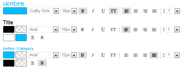
Some of you may have noticed that recently the interface of fonts setting of your modules has evolved.
We have made it more clear by expanding the area of color change and cleaning up the button style of texts.
We have made it more clear by expanding the area of color change and cleaning up the button style of texts.
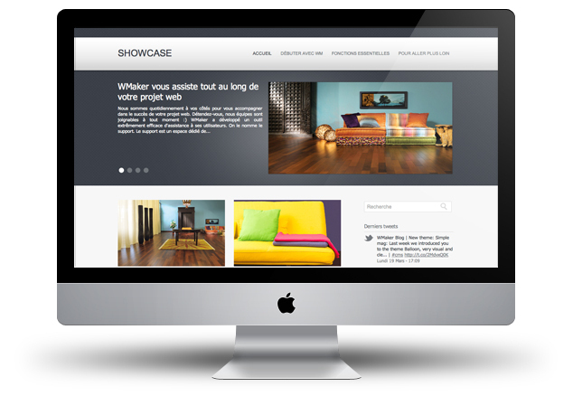
This week, we carry on the series of new themes with Showcase. Unlike SimpleMag theme previously published, this template is quite wide with its texture within the title area.
Once again, we could use a new display of a headline module that was designed during the design of this theme. This is a very simple and elegant design that we offer you. It may be selected for either a project of showcase site, or as we can show you with the pictures chosen to illustrate it, to a news site focused on design, architecture, etc. It's up to you ;)
Hoping that you like this new design and that it can give you ideas for your sites, we will see you soon for further news!
See the demo
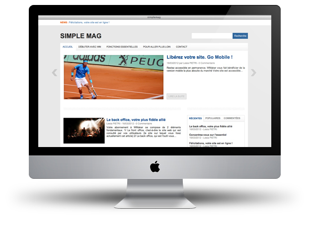
Last week we introduced you to the theme Balloon, very visual and clean, it suits showcase site as well a news site.
Today is different because the theme that we offer, as its name suggests is made for online magazine. The web magazine is originally the core business of WMaker so we wanted to make you (us) happy with this template designed to enhance all kinds of news.
The headline module display in title area is one of the main asset of this template. Its characteristic is to have the navigation arrows on the outside of the template and a slight inner shadow on the picture, which makes quite an impression.
During the integration, we also took the opportunity to make lots of small improvements, some have had a note about it and some haven't, so stay tuned :)
See the demo
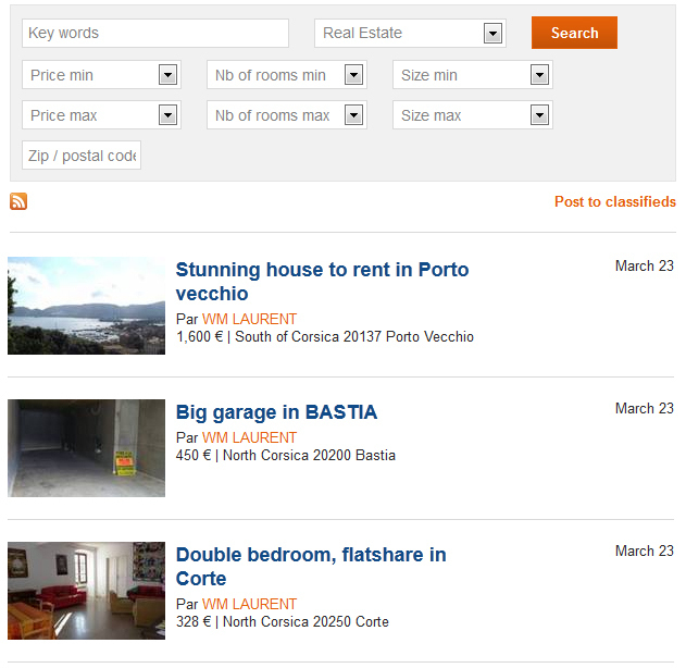
You probably know and use News modules, there is the classic one that is positioned in the columns and the horizontal news module in the title area. Well since yesterday, these two modules have very nice new features :)
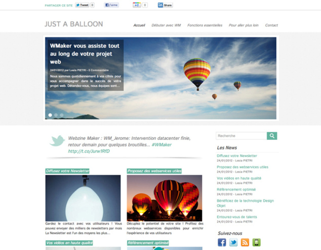
We gave you an overview at the OpenCampus. You can test it today: the new template Balloon.
This new template is very airy, very clean, colours used are soothing, it was obvious that it has to have this name.
As you can see, this design focuses on sharing in social networks, it allowed us to use the latest modules that we have created (Latest tweets, Share my site, ect ...).
This design also allowed us to highlight the use of the Headline module in title area.
Large thumbnails in content modules such as Go with the flow or navigation pages emphasize the modernity of this template.
Finally we took advantage of the implementation of Google Fonts on your sites to give more character to Balloon.
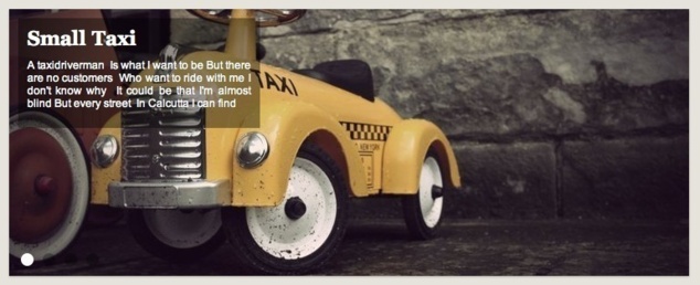
The last part of the trilogy "New headlines modules" has just been published. This last one is 100% webTV.
We offer 2 new modules and some beautiful improvment of the previous ones.
We offer 2 new modules and some beautiful improvment of the previous ones.
Since the V5, you have a lovely list of items in your back office.
This page is built with queries sorting dates in the past and future.
We had a bug on this page Wednesday, February 29, 2012 at 00:00. Why this bug? The query used to build the list of articles had the future date of February 29, 2013! As this date does not exist, your back-office posted a list of articles empty since midnight. : (
The bug was fixed early this morning.
We are sorry for the inconvenience and stress it has caused. Please accept our apologies.
Last tweets
Photostream
Last comments
-
Ken le 01/25/2014
Add chapters to your videos
-
Andrea le 09/05/2013
Add chapters to your videos
-
Florian le 05/02/2012
Lastest novelties of the month
-
Jerome Granados le 02/16/2012
Did you activate your author page?
-
masoud le 02/16/2012
Did you activate your author page?
Tags
ads
advertising
api
apps
article
atom
blog
calendar
CampusPlex
classifieds
comment
datacenter
design
design video
download
e-commerce
facebook
flash
flex
forum
gallery
google
headlines
help
hosting
iphone
management
metatag
micropayment
mobile
module
newsletter
openid
podcast
profiling
rss
search
search engine optimization
Search Engine Optimization
semantic web
seo
server
slideshow
sns
statistics
store
support
tags
template
twitter
upload
v4
video
web 2.0
webservice
webtv
wmaker
xfruits
xhtml
xml


