After years of loyal service, the flash version of the slideshow bows out. It gives way to a completely rewritten version.
The new slide show offers more features and better compatibility with devices used to view your articles.
The new slide show offers more features and better compatibility with devices used to view your articles.
– /
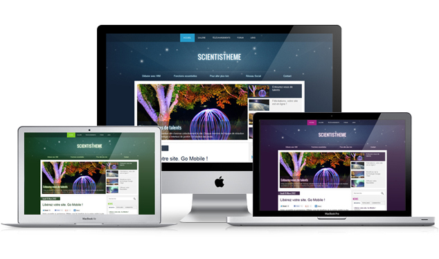
The new design we offer this week was designed to be easily declined, as you can see on the picture, it's up to you to choose which colour suits the most your project.
In each new model we try to incorporate new features that we develop each week. For example in this, you will find a Google Font, Oswald, on which we applied different shades depending on the modules and the fonts value.
In each new model we try to incorporate new features that we develop each week. For example in this, you will find a Google Font, Oswald, on which we applied different shades depending on the modules and the fonts value.

On April 24th, Google made an update of its algorithm that didn't get unnoticed. It is called "Penguin update". As you can see from the picture, this penguin is not very friendly. Some of you may have already had trouble with him :(
WMaker has made some changes in the generation of the source code of your site, to minimize the possibility of being the victim of an operation of Negative SEO.
WMaker has made some changes in the generation of the source code of your site, to minimize the possibility of being the victim of an operation of Negative SEO.
The novelty that we present today in this note concerns the forms and especially contact forms. Many of you have asked us through the support how to create a contact form and especially how to make it more attractive. So we replied to these two requests with one goal in mind, make simple to implement.
New themes from now on, will provide a contact form by default. This means that when creating a site from the portal WMaker, the contact form will be automatically included. The email address of your account ID will automatically be considered as the Recipient email.
So you will tell us: "This is all very nice but, we will not create a new site, we already have one!" Do not worry, we are also planning a "small" novelty for existing sites.
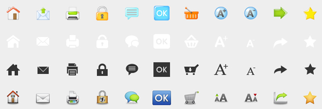
To finish off the month of April, which for most of you was wet (yes it's in Corsica it was 25 °), we introduce four new collections of action buttons.
As a reminder, the action buttons are used everywhere on your site. These include the Home, Print and Send button in the article page. You can set them on the Buttons tab in the menu General Settings > Graphical Elements. As we always say, those are certainly small details, but they make all the difference in finishing a web project.
As a reminder, the action buttons are used everywhere on your site. These include the Home, Print and Send button in the article page. You can set them on the Buttons tab in the menu General Settings > Graphical Elements. As we always say, those are certainly small details, but they make all the difference in finishing a web project.
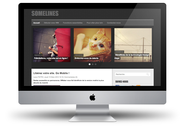
As you know, designing a theme is closely linked to the development of new products. That's why it's not only one person behind a theme but a full team. We take this note as an opportunity to thank all our developers for puting up with our webdesigners moods and always do their best to fulfill their requests that can sometimes be quite complicated to set up :)
Back to introducing this new template. Its structure is, despite the dark background, refined and quite linear as its name suggests. It is also a very different template than the ones created so far as by default it displays a module very visual: The module Go with the flow in the title area. The fonts used to highlight titles and headers of the modules, is the Font Impact, which despite his age still looks stunning :)
Back to introducing this new template. Its structure is, despite the dark background, refined and quite linear as its name suggests. It is also a very different template than the ones created so far as by default it displays a module very visual: The module Go with the flow in the title area. The fonts used to highlight titles and headers of the modules, is the Font Impact, which despite his age still looks stunning :)
Throughout last week we have developed new features for the design of your sites. Some are more important than others, so we decided to group them all in one note. Let's see all of them in detail.
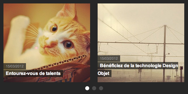
The code for this module had not been touched for a while, so not only we took the opportunity to propose a new display mode, but besides that, we also cleared it up.
You now have the Horizontal scrolling mode which allows, as its name indicates, to display several articles on a number of columns with a pager allowing navigation between them. This mode was already present in the module Headlines sections but we have slightly modified it for the module Go with the flow. Indeed, the navigation is not done with arrows but with a pager Bullet type. You must have seen it in the new modes of display of the headlines module.
The module Go with the flow was available, up till now only in the main column. To offer you more possibilities of layout, we made it available also in the title area and footer. This is the most beautiful effect, in fact you will see it in our next template coming out.
Finally, as we said earlier, we took this opportunity to clean up a little, especially in the backoffice which had become busy with all these different options. So we set up the tokens, to learn more about this feature we let you read, if it is not already done, our note about it.
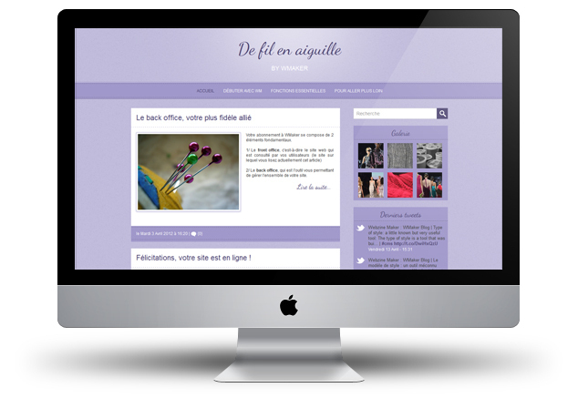
We made a promise in the last note introducing the theme CookBook, the next theme would have a different structure. What we did not say, was that it would also have a look and feel that is unlike any other.
For this model we have chosen a theme rather .... "Girly" :) Our collection is quite poor in this area and it was an opportunity to change this.
This time, we relied on the girl team of designers to achieve the WM template. The girl team plans to renew the experience for other templates.
For this model we have chosen a theme rather .... "Girly" :) Our collection is quite poor in this area and it was an opportunity to change this.
This time, we relied on the girl team of designers to achieve the WM template. The girl team plans to renew the experience for other templates.
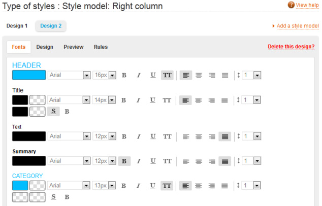
The type of style is a tool that was built with the V5. It was conceived and created during the redesign of the back office WMaker.
When we published it the first time, we had in mind a very clear idea of its use: creating a style and then apply it to all modules of a site.
But then, for my part, through its daily use, I found out that the initial version of the tool had its limit and created some frustration. So I asked for few improvements.
Above all, let's go back in time to remind you what you could do with this tool before its update.
- Create a template of module by setting its fonts (the 10 most used labels), its borders, spacing, background colours, etc.
- Preview this model from the Preview tab.
- Apply this model to existing modules (all templates or one precisely) and to future modules added.
- Apply this model to a particular module from its tab Module management.
With hindsight, we have listed the improvements to the type of style to make it even more functional. Let's check its updates.
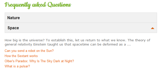
We continue our recast of all webservices of the front office V5. Following the Calendar, Classified Ads, here is the Frequently Asked Questions.
Before we get starting, we carry out a small report on the condition of the webservice, and gaps may exist with the novelties offered by the CMS.
For the FAQ, there was few, it had been a while since we had modified this webservice. So first, we gave it a general new look :)
Then we reshaped the search engine and the submit a question process . We harmonized these two elements by adopting the design pattern used in the redesign of the calendar and classified ads.
Last tweets
Photostream
Last comments
-
Ken le 01/25/2014
Add chapters to your videos
-
Andrea le 09/05/2013
Add chapters to your videos
-
Florian le 05/02/2012
Lastest novelties of the month
-
Jerome Granados le 02/16/2012
Did you activate your author page?
-
masoud le 02/16/2012
Did you activate your author page?
Tags
ads
advertising
api
apps
article
atom
blog
calendar
CampusPlex
classifieds
comment
datacenter
design
design video
download
e-commerce
facebook
flash
flex
forum
gallery
google
headlines
help
hosting
iphone
management
metatag
micropayment
mobile
module
newsletter
openid
podcast
profiling
rss
search
search engine optimization
Search Engine Optimization
semantic web
seo
server
slideshow
sns
statistics
store
support
tags
template
twitter
upload
v4
video
web 2.0
webservice
webtv
wmaker
xfruits
xhtml
xml


