Written by Jerome Granados / Katia Jannin on Monday, September 22nd 2008
|
{0} 

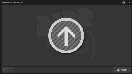
The uploader has been put online on august the first, and since then Christian and Samir have made a fixation, starting a drastic security audit on the Uploader 2.0.
But be releaved, it wasn't an imperative to apply the most bizarre tests on this nice uploader, because till then, none of you informed us about any bug.
But be releaved, it wasn't an imperative to apply the most bizarre tests on this nice uploader, because till then, none of you informed us about any bug.

We are making several tests in order to switch WMaker data base to UTF-8.
UTF-8, is a caracter code system. Its universality makes it the code system the most used on the web. It permits in particular, to resolve special caracter display problems.
For WM users, the switch to UTF-8 is quite transparent. It is way less transparent for search engines, because it will improve your portal referencing.
If the tests we're doing reveal satisfying, we're thinking about doing the UTF-8 switch on SUNDAY, DECEMBER THE 21rst 2008. From 07h to 11h GTM+2 , your access to the backoffice will be suspended.
During the maintenance process, the websites front-offices will remain accessible.
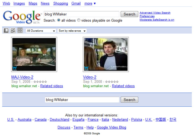
It's done, Samir has just put it online! Your site has his own video sitemaps.
Thanks to this automatically sent data, your video referencing will be greatly improved.
Thanks to this automatically sent data, your video referencing will be greatly improved.
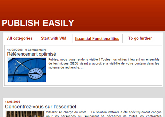
The display type we're proposing you today for the headlines section module is LINK. It's a variante for the tab display type.
To use this presentation type, go in FUNCTIONALITY menu > Display and choose the presentation type "links".
By default, the first module link names "all categories" . It is possible to change that link name or not to display it at all. Go in FUNCTIONALITY > display > more parameters.
See you next week for the last display type for the headlines section ;)
After the player; update and the new uploader online, the next one to benefit a lot of new improvements is the video Page.
The video Page ( available from Blog Pro ) is the navigation page that lists all your website videos. So far, this page thumbnails leaded to the articles which had a video in. To read the video, it was necessary to open the corresponding article.
Now, the video page is totally transformed. It still permits to list the videos, but the big change is that now, it's possible to read the video directly in the page.
The new video page principle is simple. Divided in 2 parts, it works like this :
- In the upper zone, the visitor plays the videos
- In the lower zone, he navigates through your website video content.
This post will please our Blog+ subscribers. We've added a very interesting functionality which permits generating incomes from your website: the insertion of advertising between your blog posts.
More precisely, we've overhauled totally the "my posts" module. Thanks to this module, a simply solution to display advertising is available to you. It's an alternative to the use of the container module or the advertising manager webservice ( available from the Xpert portal ).
In the "my posts" module > functionnalities > more parameters you'll find a field to add your advertising between your posts. Insert text or html code in this field.
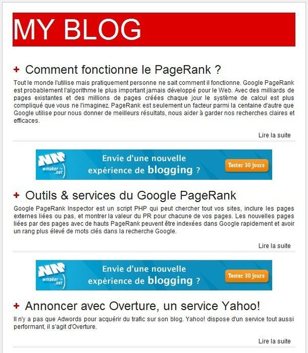
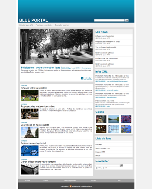
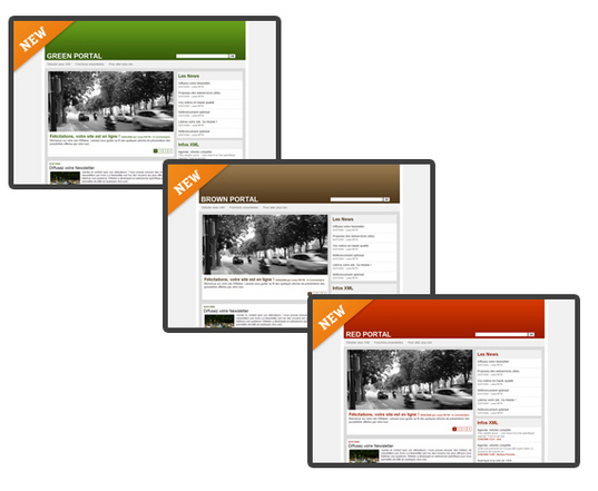
This week template is BLUE. It can be used for a portal or a blog.
Efficient and simple, this template is also a very good start point for your personnalized design.
Soon now, the new RED, BROWN and GREEN templates will join BLUE.
Efficient and simple, this template is also a very good start point for your personnalized design.
Soon now, the new RED, BROWN and GREEN templates will join BLUE.
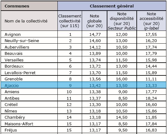
We're very proud we've found out today that Ajaccio city website is classified in the top ten of public information online accesibility.
Why underline it? Simply because Ajaccio.fr is wmaker's and the rank established by public sector socities and IP-label is based on an evaluation of the technic perfomances of the website. This evaluation is also based on the quality and easy access to the information it contains.
Overhauling ajaccio.fr website, we've worked hard on the best way to organise the city website information. It results a not deep tree structure ( 1 level maximum), and the add of a top and bottom bar to reach directly all contents.
The quality of the city service editorial production, and the WM application architectural performances permitted to obtain this great rank. See you next year!
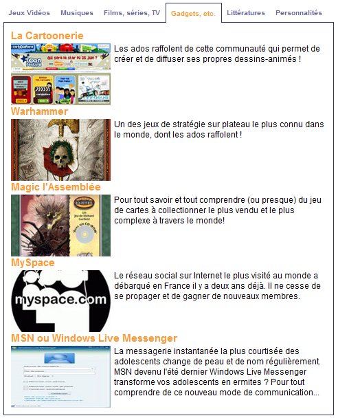
Here's a display mode for the headlines section module, that many of you waited for: articles displayed in different tabs. Here's an exemple www.jtexplique.fr
To use this display mode, it's as simple as going in the DESIGN page in the backoffice. If it's not already done, add an "headlines section" module in a column of your website.
In the functionnalities menu of your module, choose the display tab. There you'll find the "tab" display mode. Border and background color choice is available in the font menu.
With this display type, you will be able to compete against the biggest online daily newspapers!
Last tweets
Photostream
Last comments
-
Ken le 01/25/2014
Add chapters to your videos
-
Andrea le 09/05/2013
Add chapters to your videos
-
Florian le 05/02/2012
Lastest novelties of the month
-
Jerome Granados le 02/16/2012
Did you activate your author page?
-
masoud le 02/16/2012
Did you activate your author page?
Tags
ads
advertising
api
apps
article
atom
blog
calendar
CampusPlex
classifieds
comment
datacenter
design
design video
download
e-commerce
facebook
flash
flex
forum
gallery
google
headlines
help
hosting
iphone
management
metatag
micropayment
mobile
module
newsletter
openid
podcast
profiling
rss
search
search engine optimization
Search Engine Optimization
semantic web
seo
server
slideshow
sns
statistics
store
support
tags
template
twitter
upload
v4
video
web 2.0
webservice
webtv
wmaker
xfruits
xhtml
xml


