Written by Jérôme Granados / Katia Jannin on Wednesday, October 1st 2008
|
{0} 

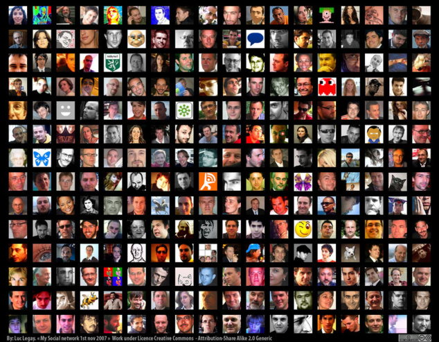
Small but efficient, the social network module is the piece that lacked to your portal to enjoy the most your SNS functionnalities.
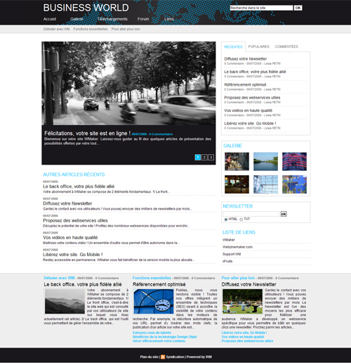
The template overhaul continues. This week, we're proposing a new version of World.
There were a lot of discussing about this template overhauling. We finally landed with 2 propositions between which it has been difficult to choose. So we decided to create both!
Today, we've finalised the first proposition we've called BUSINESS WORLD.
Business world is a 2-column template, which gives a impression of professionalism and seriousness. It's the ideal template to give a "corporate" touch to your website.
In order to fully enjoy your SNS, you have of course to create your profile. Profile will inevitably lead to registration and then authentification on your portals.
In this note, we come back on the improvements we brought to the registering and authentification processes, on the occasion of the SNS page creation.
In this note, we come back on the improvements we brought to the registering and authentification processes, on the occasion of the SNS page creation.
SNS is now available for all WMaker users, and not only for the Beta Testers anymore. In this note, we'll present you the new pages that will permit to create a whole community around your portal.
Creating the business world new template, we've also worked on the News module.
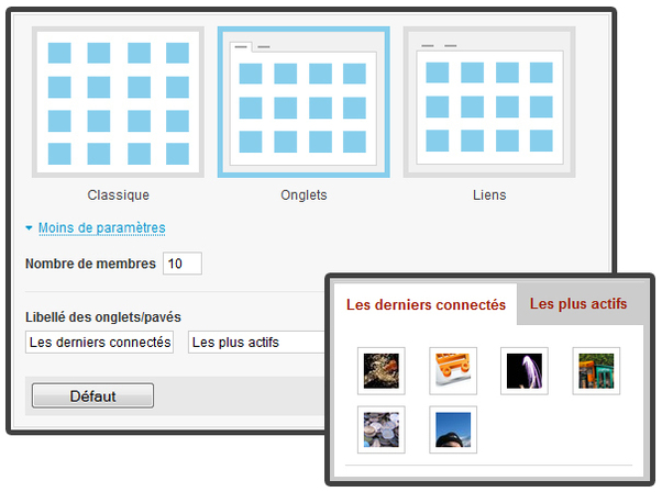
This module has now 3 display modes: Classic, Tabs and Links.
Classic display already existed. It didn't change. We've just added the possibility to display le number of comments.
What's new, is the Tabs and Links display modes. They permit to cut the news display in 3 groups:
Also note the new ergonomy of the functionnality parameters.
In theory, it should be more clear. Isn't it?
This module has now 3 display modes: Classic, Tabs and Links.
Classic display already existed. It didn't change. We've just added the possibility to display le number of comments.
What's new, is the Tabs and Links display modes. They permit to cut the news display in 3 groups:
- the most recent
- the most popular
- the most commented
Also note the new ergonomy of the functionnality parameters.
In theory, it should be more clear. Isn't it?

On the business world release occasion, we've added a new option in order to configurate your website design. It's the full-screen display.
Thanks to this option, you'll be able to display, out of the gabarit, the color or the wallpaper of certain zones (as you can see in the screenshot above).
Thanks to this option, you'll be able to display, out of the gabarit, the color or the wallpaper of certain zones (as you can see in the screenshot above).
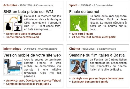
Change your headlines section display for the block style. This presentation type permits display content blocks. It makes all the difference in a 2 column-type display.
During summer, we've worked on the expansion of "social functions" at WMaker.
The SNS (Social Networking Service) launch in your portals is imminent. We're adjusting the last details.
The number of Internauts who are adopting Web Social is greatly increasing. After the early adopters, now it's the professionnals turn to be willing to propose social functions on their sites.
Those functions allows the user to create a enriched profile, to send private messages, be part of a group, constitute a friend network, update their status, share photos, videos, comments, etc...

Your sections can be displayed different ways. We worked on the "archive" mode to bring it some modifications.
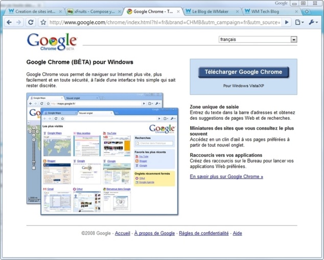
All the blogs are talking about it. Google has released its own Web browser.
We already have questions in the technic support concerning its compatibility with WMaker. It's a Beta version, thus it's still bugged, even if Google took the safari renderer.
You noticed few display bugs. Thanks to warm us about the problems you could meet, and we'll find the astutes to have a similiar display as the other browsers. But it's also up to google to work on its browser.
We have tested this browser too. By the way, I've found it a very good and ergonomic idea to place the tabs on the top of the address bar. It comes out of it a impression of simplicity.
You can read all over the Web that it has a extremely powerfull javascript engine nammed V8. We've made a performance test on the Web and it results that Chrome is very fast, twice as Firefox after the
Bench Test.
But the Javascript engine is young and generates problems with some functions of the backoffice. We've faced the same problem with Safari which took a year to reach Firefox and IE level.
Competition is rude, firefox has just announced a Javascript engine even faster for its 3.1 version. This competition is useful, Javascript is playing for a big part in the web applications, and so in our CMS. It permits to have a user experience close to a soft. To be clear, your site administration will be faster very soon.
Behind this Javascript engine, the technic stakes are hight, because it's a pillar of what we call WebOs. The WebOs is replacing Windows, MacOs, Linux by a browser, all applications being online.
It's good news, because, it's thinking about this, that we chose in 2001 to create a CMS with a 100% Web administration. Today it makes full sens!
For a conclusion, Chrome is a beautiful browser, with a bunch of good ideas, but, as all softs, it needs some months to be adjusted, specialy for the Javascript.
Last tweets
Photostream
Last comments
-
Ken le 01/25/2014
Add chapters to your videos
-
Andrea le 09/05/2013
Add chapters to your videos
-
Florian le 05/02/2012
Lastest novelties of the month
-
Jerome Granados le 02/16/2012
Did you activate your author page?
-
masoud le 02/16/2012
Did you activate your author page?
Tags
ads
advertising
api
apps
article
atom
blog
calendar
CampusPlex
classifieds
comment
datacenter
design
design video
download
e-commerce
facebook
flash
flex
forum
gallery
google
headlines
help
hosting
iphone
management
metatag
micropayment
mobile
module
newsletter
openid
podcast
profiling
rss
search
search engine optimization
Search Engine Optimization
semantic web
seo
server
slideshow
sns
statistics
store
support
tags
template
twitter
upload
v4
video
web 2.0
webservice
webtv
wmaker
xfruits
xhtml
xml


