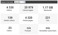
The statistics homepage now displays a dashboard, have you noticed?
With this summary table, in a quick glance, be aware of your statistics for the current month.
The dashboard is made of several blocs. It displays the datas for which it's interesting to follow the evolution (visits, video, mobile, bandwidth,...)
For some blocs, a direct link to the online help gives you explainations on the data. It's greatly useful if you're not sure about the difference between a "visit" and a "visitor" ;)
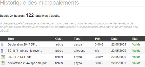
Do you know the micro-payment ? Even if we rarely speak about it, this functionnality has been available for a long time.
The micro payment enables to charge your users for some content of your site, when they need it, without forcing them to take a subsciption.
To pay, they use a service as paypal, moneybookers or allopass.
Be aware that you can now consult the history of the micro-payment operated on your site.
The micro payment enables to charge your users for some content of your site, when they need it, without forcing them to take a subsciption.
To pay, they use a service as paypal, moneybookers or allopass.
Be aware that you can now consult the history of the micro-payment operated on your site.

We've developped a new module in the webservice category, entitled Web Services 2.0. It enables creating links to the pages you own in the most popular social networks.
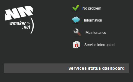
The Service Status Dashboard is a new tool that all WMaker users must be aware of and bookmark !!
During the incident of last May 6th, we've been overwhelmed by phone calls. WM community grows fast and although that kind of incident is very rare, it leaded us to rethink our communication tools.
Thus, the next day, we decided to create a crisis information system for the community.
It's based on our own monitoring tools, and its name is SSD (nothing to do with a flash memory hard drive).
The Service Status Dashboard is a tool that keeps you updated about the different break downs, their status and the resolution, in real time. This tools is totally disconnected from the architecture, the data center, the domain name, etc... It's totally independant and can always be available to keep you updated in case of incident.
Transparency
It happens that someone at WMaker makes a "mistake". We are used to not blow this up out of proportion. This enables to keep tranparence between us and so a total confidence in each other. We've always been transparent with our clients, at the risk of talking in a too technic way sometimes. This tool will enable us to increase that transparence will.
How does that work?
There are 3 status to signal an incident: information on the incident, maintenance and/or current maintenance, service interrupted.
For each incident, a thread is opened explaining what we are doing or the nature of the operation. The table displays the serious incidents by service categories, for the last 8 weeks (day by day).
Be careful, here we are only dealing with incidents on the servers, or network problems.
Conception and execution of the tool.
We widely got inspired from a similar tool edited by a famous search engine.
But apart from this: execution Gillian / design and CSS Lesia.
The URL: http://status-wmaker.net
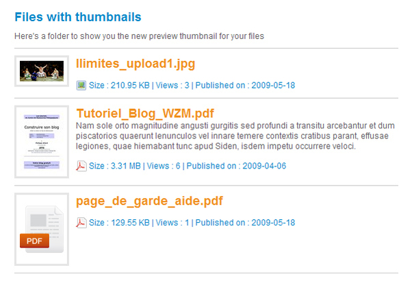
In the download webservice, adding a file, WMaker CMS automatically creates a thumbnail of the file. This thumbnail is the file preview.
They are generated for most of the file formats you use in the webservices (.pdf, .doc, .jpg, ...). Technically, we operate a snapshot. For an exemple, the snapshot is made on the first page of the file.
They are generated for most of the file formats you use in the webservices (.pdf, .doc, .jpg, ...). Technically, we operate a snapshot. For an exemple, the snapshot is made on the first page of the file.

With this whole new Related Articles module, you'll satisfy your visitors. This module enables to place within an article page, a block that contains links to similar content articles.
This module is available for the Pro Portals. The module is dynamic and the options are numerous. Thus adding a Related Articles module in your article pages, there are great chances that your traffic raises. Indeed, suggesting the visitor to read an article about the same topic encourages greatly the click!
This module is available for the Pro Portals. The module is dynamic and the options are numerous. Thus adding a Related Articles module in your article pages, there are great chances that your traffic raises. Indeed, suggesting the visitor to read an article about the same topic encourages greatly the click!
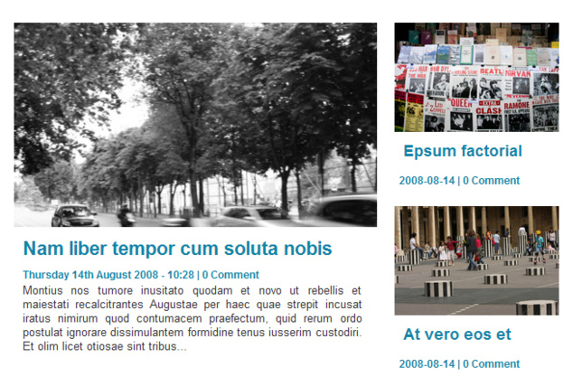
Modern 6 is a new presentation style for your headlines. It's been already used for several weeks on the Marianne2.fr website.
It has been developped on the occasion of this website design overhaul.
Today, it's available for all WMaker users. Indeed, the WMaker community takes advantage of our collaboration with Marianne2.fr
Anytime an innovation can be generalised to the all application, we do it.
It has been developped on the occasion of this website design overhaul.
Today, it's available for all WMaker users. Indeed, the WMaker community takes advantage of our collaboration with Marianne2.fr
Anytime an innovation can be generalised to the all application, we do it.
We're proposing today an innovation directly coming from WMaker Labs.
It's the Quick Design function. For a side story, the code name of the Quick Design during the creation phase was Color Blender. You'll quickly understand why ;)
It's the Quick Design function. For a side story, the code name of the Quick Design during the creation phase was Color Blender. You'll quickly understand why ;)
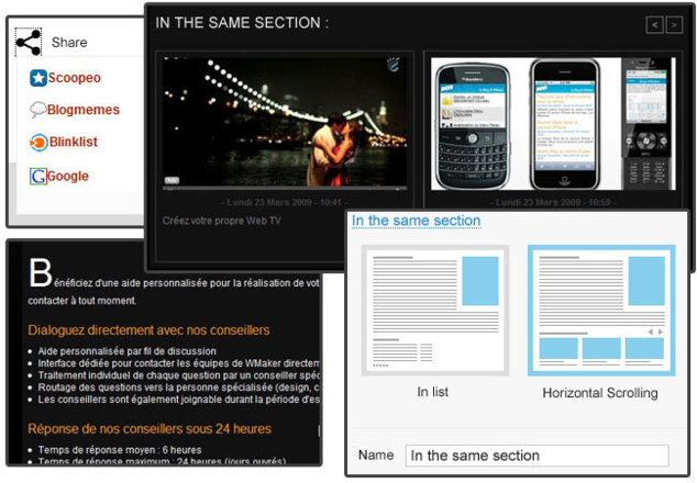
Remember, last november, we put online a series of novelties thanks to our collaboration with Marianne2.fr the online version of the French newspaper.
Today, for another time, the WMaker community is going to take advantage of this collaboration.
Indeed, we've worked for a few weeks with Marianne2 on improvements to bring to the article page.
I propose to discover in this note a series of novelties that will enable give style to your article pages.
All the novelties are to be found in DESIGN > Page Design > Page. Note that the organisation of the settings has been simplified. A lot of parameters has been placed in the advanced layout menu (action buttons, in the same section, visitor counter, author, section of the article)

After a very serious injury occured on december 25th 2006, and 2 years and a half of convalescence, Gillian is finally back!
Gillian, the Version 4 and 3 architect, sprang back yesterday afternoon.
Gillian is the most brilliant developer I've ever known. Not only is he impressively efficient with only some drafts as specifications, but he is also capable of creating a hight-level web application. But above all, he has a creative sense out of the common.
I have a thousand exemples of his brilliant intuitions to give you. But now, I'd like to deal with a little development of few code lines he took 5 minutes to type after a discution in front of a coffee.
It was in 2006, we had more and more SPAM in the comments. The ultimate solution back then was to use the captchas, you know, that distorted letters to copy in a field, or worst, the stupid questions to answer.
This enabled make the difference between a real Internaut who can answer a captcha and a spamer robot that can't understand the requirement.
I told him that I found it stupid to constraint the visitor. We had to find another system.
That's how Gillian invented the Finger Print, a system that still blocks 95% of the spams in the comments. Back then I found it almost normal to find this solution.
But a year after that, I realised that no-one used our system and everyone continued to constraint the visitor with the captchas.
I understood then how Gillian had once more guessed right.
Only lately I read an article on a famous Web2.0 blog, dealing with a US blog platform that had integrated an anti spam system in the comments, presenting it as particulary sophisticated....
This little exemple reveals the creative force our 26 years old technic director is capable of...
Welcome back Gillian, I'm looking foward you dawn us upon again!
Last tweets
Photostream
Last comments
-
Ken le 01/25/2014
Add chapters to your videos
-
Andrea le 09/05/2013
Add chapters to your videos
-
Florian le 05/02/2012
Lastest novelties of the month
-
Jerome Granados le 02/16/2012
Did you activate your author page?
-
masoud le 02/16/2012
Did you activate your author page?
Tags
ads
advertising
api
apps
article
atom
blog
calendar
CampusPlex
classifieds
comment
datacenter
design
design video
download
e-commerce
facebook
flash
flex
forum
gallery
google
headlines
help
hosting
iphone
management
metatag
micropayment
mobile
module
newsletter
openid
podcast
profiling
rss
search
search engine optimization
Search Engine Optimization
semantic web
seo
server
slideshow
sns
statistics
store
support
tags
template
twitter
upload
v4
video
web 2.0
webservice
webtv
wmaker
xfruits
xhtml
xml


