Written by Jerome Granados / Katia Jannin on Wednesday, February 11th 2009
|
{0} 

WMaker enjoys improving the iPhone version of your sites. The various advantages of this mobile phone (touch screen, developped web browser(safari), accelerometer) enable proposing a user experience of good quality. We're not without ideas to take the most of those tools at WM. So we've put online a new wave of novelties:
With a touch screen, using the mobile becomes very intuitive.
With iPhone, we always click less. We prefer moving the elements from left to right, up to bottom, we caress it, brush it... In short, we take the use to make the image scrolling with only a flick.
It was impossible for us not to propose this type of browsing in our galleries. So now, it's online. Go on, test it, and enjoy ;)
For another part, a lot of you wanted to be enabled to display the photo copyrights in the mobile galery. From now that's available. To do so, type your text in the description zone of the photo.
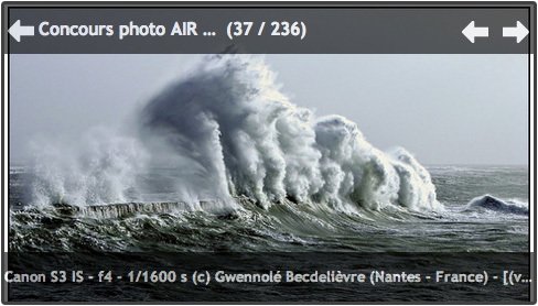
The footer module of the iPhone version has changed. We propose you a range of icons that will lead your visitors to the key pages of your site mobile version.
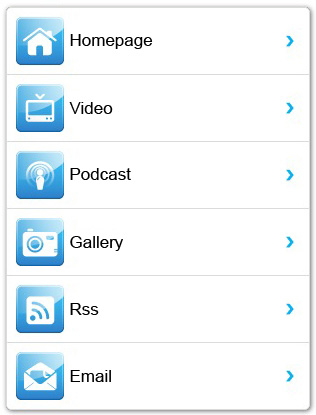
Working on this overhaul, the main goal was to propose extra large icons so that they could be easily clickable. That was the last footer presentation flaw.
Only the most dexterous could reach the targeted link in a first time :)
From now, for each link, the active zone is huge.
Only the most dexterous could reach the targeted link in a first time :)
From now, for each link, the active zone is huge.
We've put online some novelties concerning the online help. The autonomy and simplicity are what you expect first of WM. So we tried to make this help even more easy to use.
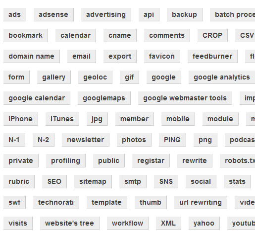
Quick help is a new way to consult the online help. It's a tag wall. It enables finding quickly the answer to your questions.
Tags are classifieds in alphabetical order. The key words that lead to a same answer can be diferent, so that anyone is able to reach the information.
For an exemple, the help that enables you setting your messaging will be reachable from the following words : email, mail, iPhone, pop3, smtp.
Quick help is accessible clicking on the help link, on the right top corner of your backoffice, and then, enter the sub menu Help Center > Quick help (left menu).
On Saturday 17th January we have upgraded some servers. On the list: RAM add, Bios updates, processors switch, etc...
This maintenance, that has occupied us for a big part of the night, has been recorded partially. Because not everyone is working at the same time during the maintenance, it enabled us to be also behind the camera, to show you a little the atmosphere of that kind of nights, that often ends in the early dawn.
This maintenance, that has occupied us for a big part of the night, has been recorded partially. Because not everyone is working at the same time during the maintenance, it enabled us to be also behind the camera, to show you a little the atmosphere of that kind of nights, that often ends in the early dawn.
The design of the "headlines section" for the mobile version has been overhauled. The main novelty is the Collapse/Expand mode.
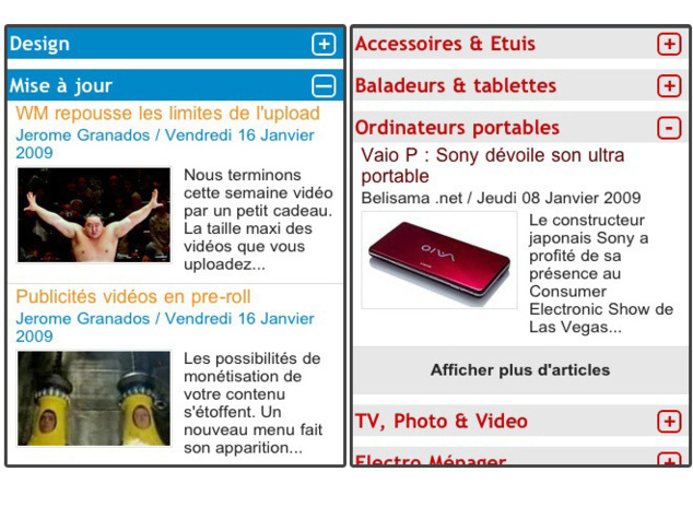
First, let's see the display of the articles in the module. It's the same as in the headlines module, position 2 to 4: a 16/9 thumbnail, the title, the author, the date and break.
So, what's that Collapse/Expand mode? Note the appearance of a "+" to the right of the title.
A click on that symbol will expand the section. Click again, and the folder will collapse. Or click on another + and the opened section will collapse by itself to let the second expand.
In each section, you'll find the big clickable link "more articles". The number of additional articles that appear on each click is the number of articles you display by default. That is to be set in DESIGN > mobile design. Just add a Headlines Section module.
The headlines and the Latest News are the first modules that your visitors consult. We've widen the presentation possibilities of their content on your website mobile version homepage.
Now that's up to you to add your personnal touch.
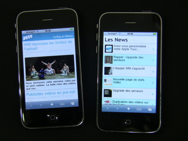
The iPhone version of the Headlines Module improves. There are now 4 available positions: a principal and 3 secondary positions.
Position 1 (principal): a title and a complete illustration. Below, the summary or the start of the first paragraph.
Position 2 to 4 (secondary positions): title + 16/9 illustration (remember to use the crop function writting your articles) + summary or paragraph break.
Note the appearance of new fonts to set the author name, the date and the break text.
To customize your iPhone headlines module, go in DESIGN > mobile design > headlines
Get prepared for novelties for the iPhone version. Here's a tip, start now to work on your Apple Touch Icon, there are great chances that you readers won't resist bookmarking the excellent mobile version of your site :)
The Apple Touch Icon is the icon that appears on the home screen of your iPhone when you choose to add a Web Bookmark (or an application).
With your WMaker site, you automatically have an optimized mobile version for iPhone. WM detects the terminal of the user (computer, mobile, iPhone) and take in charge to send him the most adapted version. That, you already knew. But did you also know that you could customize your Apple Touch Icon?
To do so, go in DESIGN > mobile design > More Settings and upload your creation. The Apple Touch Icon is a square image of 57px.
Preparing the iPhone version novelties, we redesigned ours. Here it is on the image below, next to an (incomplete) series of Apple Touch Icon of WM sites.
Stay tunes ;)

We're ending the week with a little gift. The maximum size of the videos you upload on your sites has been raised.

Depending on your offer, here are the new limits:
- Portal Pro: 500 Mo
- Portal Xpert : 500 Mo
- Blog Pro : 150 Mo
- Blog + : 150 Mo
Those limits are applying on the videos but also on all the files of the download webservice.
We are done with the video phase... but not for that long. We're planning to work on the servers and the encoding from now. Let's go for HD !!
The possibilities to generate income from your content are widening. A new menu has appeared in the webservices menu > advertising manager. It's the video ads manager menu, that enables adding ads in pre-roll.
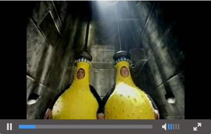
A pre-roll advertising is an ad that is displayed before the launch of the video the visitor chose to watch.
Here's a pre-roll video ad, added before the last summer interview of Christian.
During the pre-roll, the time line of the player is inactive. The user must see the all pre-roll before he can watch the desired video. If he clicks on the pre-roll, he will be redirected to the site of the advertiser.
The maximum size of the video file you will use is 4Mo. This matches 1 minute of ad. Note that the best compromise for a pre-roll video is to last between 10 and 20 seconds.

2009 beginning, the WM team has been completed by a new comer: Christophe Spinetti.
After having worked in the commercial service of an online CRM, Christophe has decided to join us to participate to the firm expansion. He already knows us well as he's been managing a webzine for 2 years.
Christophe will work with Jérôme Granados to strengthen the link between WM and the users. His role is to be in direct contact with you in order to understand your expectations better and thus help you handle you web creations.
Last tweets
Photostream
Last comments
-
Ken le 01/25/2014
Add chapters to your videos
-
Andrea le 09/05/2013
Add chapters to your videos
-
Florian le 05/02/2012
Lastest novelties of the month
-
Jerome Granados le 02/16/2012
Did you activate your author page?
-
masoud le 02/16/2012
Did you activate your author page?
Tags
ads
advertising
api
apps
article
atom
blog
calendar
CampusPlex
classifieds
comment
datacenter
design
design video
download
e-commerce
facebook
flash
flex
forum
gallery
google
headlines
help
hosting
iphone
management
metatag
micropayment
mobile
module
newsletter
openid
podcast
profiling
rss
search
search engine optimization
Search Engine Optimization
semantic web
seo
server
slideshow
sns
statistics
store
support
tags
template
twitter
upload
v4
video
web 2.0
webservice
webtv
wmaker
xfruits
xhtml
xml


